3 Plot data
For convenience, we first define a plot theme:
3.1 Define plot theme
min.absorb <- min(blanks$blank)
max.absorb <- max(standard$absorbance)
font.size <- 11
# Define theme for plotting
#' @param title.hjust horizontal alignment of plot title
#' @param legend_pos legend position
#' @return theme for ggplot
theme_plot <- function(
  title.hjust = 0, legend.pos = "right", legend.dir = "vertical") {
  theme(
    axis.text = element_text(
      size = font.size,
      face = "bold"
    ),
    axis.title.x = element_text(
      size = font.size,
      hjust = 1
    ),
    axis.title.y = element_text(
      size = font.size,
      hjust = 0.9
    ),
    plot.title = element_text(
      size = font.size + 2,
      face = "bold",
      hjust = title.hjust
    ),
    plot.margin = rep(grid::unit(1, "cm"), 4),
    axis.line = element_blank(),
    legend.position = legend.pos,
    legend.direction = legend.dir,
    legend.text = element_text(size = font.size),
    legend.title = element_text(size = font.size)
  ) +
    background_grid(
      major = "yx",
      minor = "",
      colour.major = "grey90",
      size.major = 0.2
    )
}
3.2 Plot standard
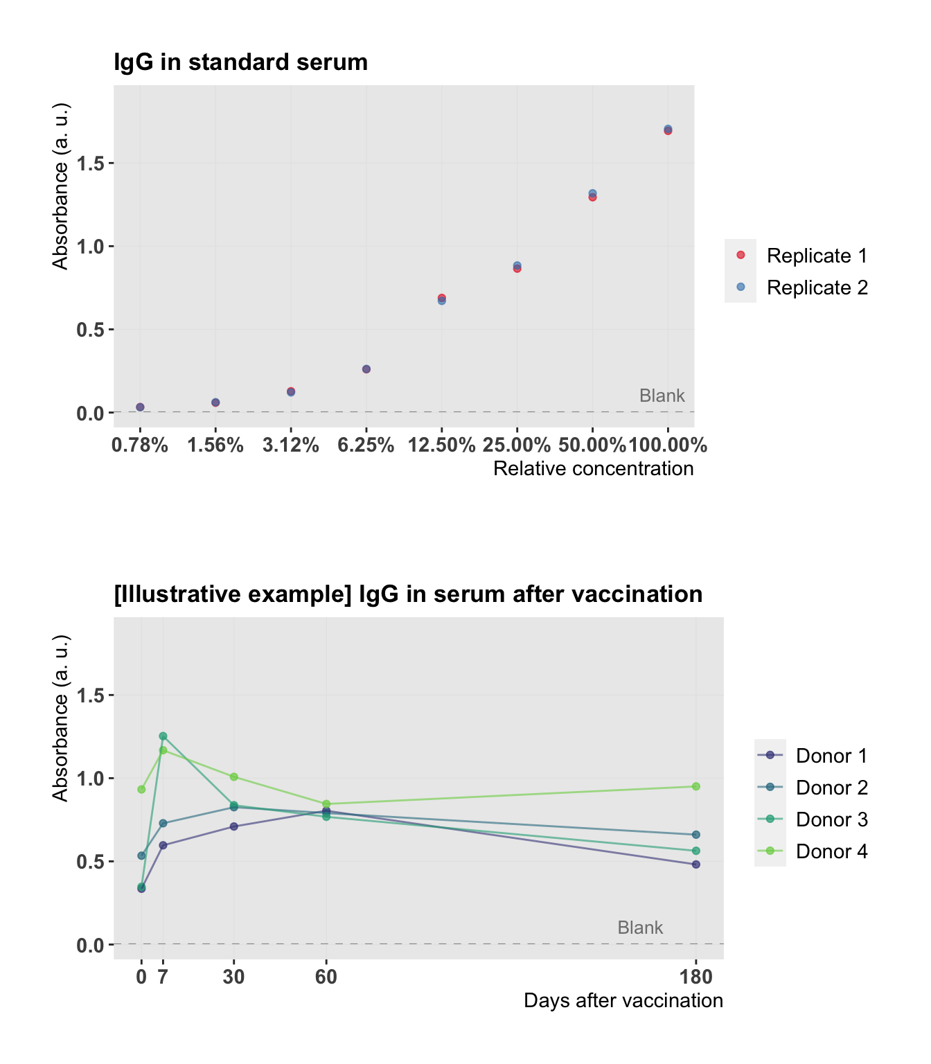
Now let’s plot the standard:
plot.std <- function(semilog = FALSE) {
  p <- ggplot(data = standard) +
    scale_color_brewer(
      palette = "Set1",
      labels = paste("Replicate", seq(n.repl.std)),
      guide = guide_legend(title = "")
    ) +
    scale_y_continuous(
      limits = c(min.absorb, max.absorb + 0.1 * max.absorb)
    ) +
    geom_hline(
      yintercept = mean(blanks$blank),
      lty = 2,
      color = "grey60",
      lwd = 0.2
    ) +
    theme_plot()

  if (semilog == TRUE) {
    p <- p + geom_point(aes(concentration, absorbance, color = replicate), alpha = 0.6) +
      labs(
        x = "Relative concentration",
        y = "Absorbance (a. u.)",
        title = "IgG in standard serum"
      ) +
      scale_x_continuous(breaks = concentrations, labels = scales::percent, trans = "log2") +
      annotate("text",
        label = "Blank",
        x = max(standard$concentration) - 0.05 * max(standard$concentration),
        y = max(blanks$blank) + 20 * max(blanks$blank),
        size = 3.5,
        color = "grey50"
      )
  }
  else {
    p <- p + geom_point(
      aes(concentration, absorbance, color = replicate),
      alpha = 0.6
    ) +
      labs(
        x = "Relative concentration",
        y = "Absorbance (a.u.)",
        title = "IgG in standard serum"
      ) +
      scale_x_continuous(breaks = round(concentrations,1),
                         labels = scales::percent) +
      annotate("text",
        label = "Blank",
        x = max(standard$concentration) - 0.05 * max(standard$concentration),
        y = max(blanks$blank) + 0.2 * max(blanks$blank),
        size = 3.5,
        color = "grey50"
      )
  }
  p
}
plot.std()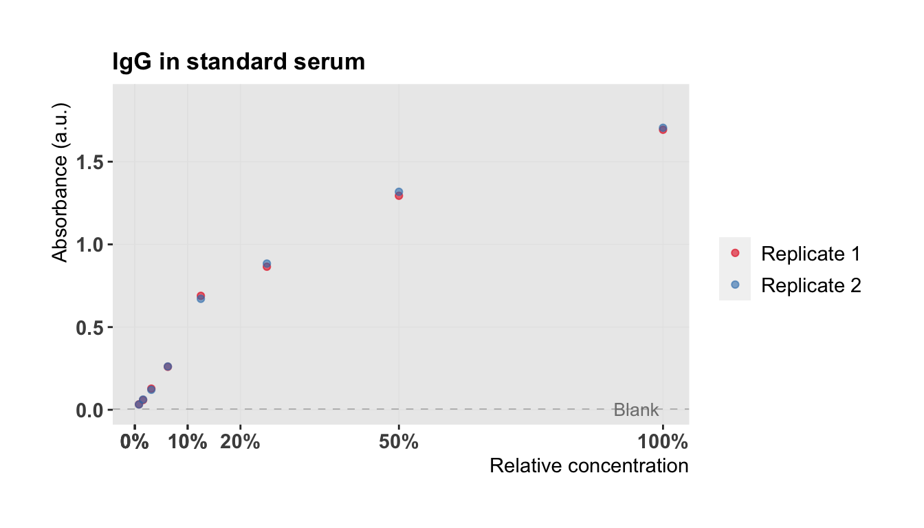
We see that the concentration of the dilution series is on a logarithmic scale. Let’s replot the results with \(\log_2\)-transformed concentrations (\(\log_2\) for a dilution factor of 2):
plot.std(semilog = TRUE)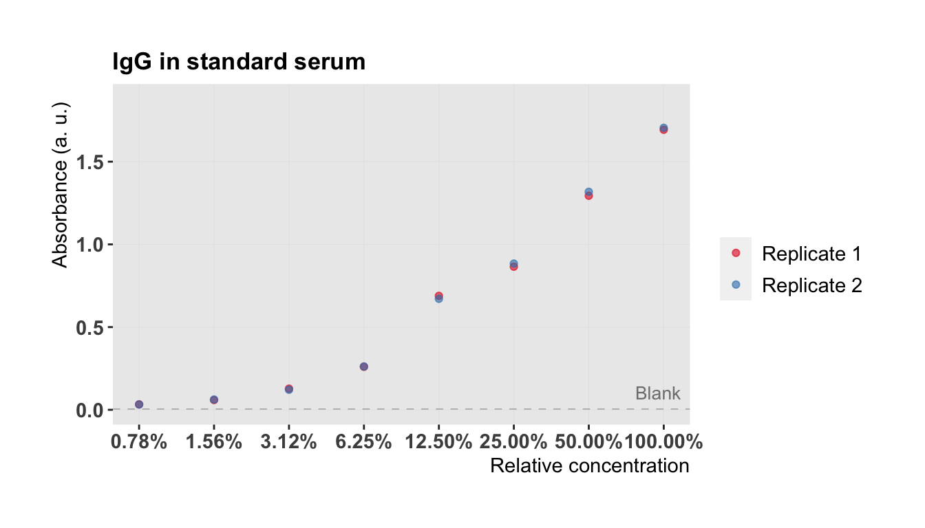
3.3 Plot biological samples
Now let’s have a look at our actual data. We measured IgG in serum of four donors on five different time points. We first define a plot for our biological samples and then plot it together with the standard curve to have a better overview.
# Select biological samples
ID.selected <- c("AB1981", "CD1982", "EF1983", "GH1984")
donors.av <- donors.av %>% dplyr::mutate(ID = rep(ID.selected, each = 5))
donors.av
## # A tibble: 20 x 4
## donor time absorbance.av ID
## <fct> <int> <dbl> <chr>
## 1 1 0 0.336 AB1981
## 2 1 7 0.596 AB1981
## 3 1 30 0.710 AB1981
## 4 1 60 0.804 AB1981
## 5 1 180 0.482 AB1981
## 6 2 0 0.534 CD1982
## 7 2 7 0.729 CD1982
## 8 2 30 0.825 CD1982
## 9 2 60 0.790 CD1982
## 10 2 180 0.660 CD1982
## 11 3 0 0.347 EF1983
## 12 3 7 1.25 EF1983
## 13 3 30 0.837 EF1983
## 14 3 60 0.768 EF1983
## 15 3 180 0.563 EF1983
## 16 4 0 0.932 GH1984
## 17 4 7 1.17 GH1984
## 18 4 30 1.01 GH1984
## 19 4 60 0.845 GH1984
## 20 4 180 0.950 GH1984plot.donors <- ggplot() +
geom_point(data = donors.av,
aes(time, absorbance.av, color = donor), alpha = 0.7) +
geom_line(data = donors.av,
aes(time, absorbance.av, group = donor, color = donor), alpha = 0.6, lwd = 0.5) +
labs(
x = "Days after vaccination", y = "Absorbance (a. u.)",
title = "[Illustrative example] IgG in serum after vaccination"
) +
scale_color_viridis(
begin = 0.2, end = 0.8, discrete = TRUE,
labels = paste("Donor", seq(n.donors)), guide = guide_legend(title = "")
) +
scale_y_continuous(limits = c(min.absorb, max.absorb + 0.1 * max.absorb)) +
scale_x_continuous(breaks = tpoints) +
geom_hline(
yintercept = mean(blanks$blank),
lty = 2, color = "grey60", lwd = 0.2
) +
annotate("text",
label = "Blank",
x = max(donors$time) - 0.1 * max(donors$time),
y = max(blanks$blank) + 20 * max(blanks$blank),
size = 3.5, color = "grey50"
) +
background_grid(
major = "yx", minor = "", colour.major = "grey90", size.major = 0.2
) +
theme_plot()